Redefining the way to register to Vote!
Seamless, Linear and Engaging
Regivote is an app & responsive website that helps first-time voters register to vote in an American election.
Eliminating Barriers
Guidance from the first step of the process
Clean and simple style to reduce mental load
Inclusive for different languages
Transparent process to build trust among users
Eagle Mascot & Minimalism
One portion of the registration form per screen providing readability and clarity of thought
Specific animations to entice the user to complete the linear flow
Progress bar to give users a sense of accomplishment
UI consists of neutral tones with the exception of green signifiers to provide focus and clarity of choice
Replay Value
Completion of the process rewards user to a final animated splash page
Entices users to aid friends and family to also register to vote
Carity of instructions provided at the beginning and end of user flow
User Researcher & UI / UX Designer
May - June 2022
Figma, Adobe CC, After Effects, Clip Studio Pro
The American Election happens across federal, state and local levels.
Voting Regulations are different from state to state
Voter Registration Context
One-in-ten eligible voters will be members of Generation Z
Those with higher incomes have greater registration & voter turnouts
I interviewed 5 immigrants that have recently been granted citizenship allowing them to vote in the California Primaries. As well as 3 members of Gen Z to understand:
Their reasonings to register
Their goals and needs during the process
The apps / websites that are already being utilized
Their frustrations and current behavior
The benefits that RegiVote could provide
The challenges we could face moving forward

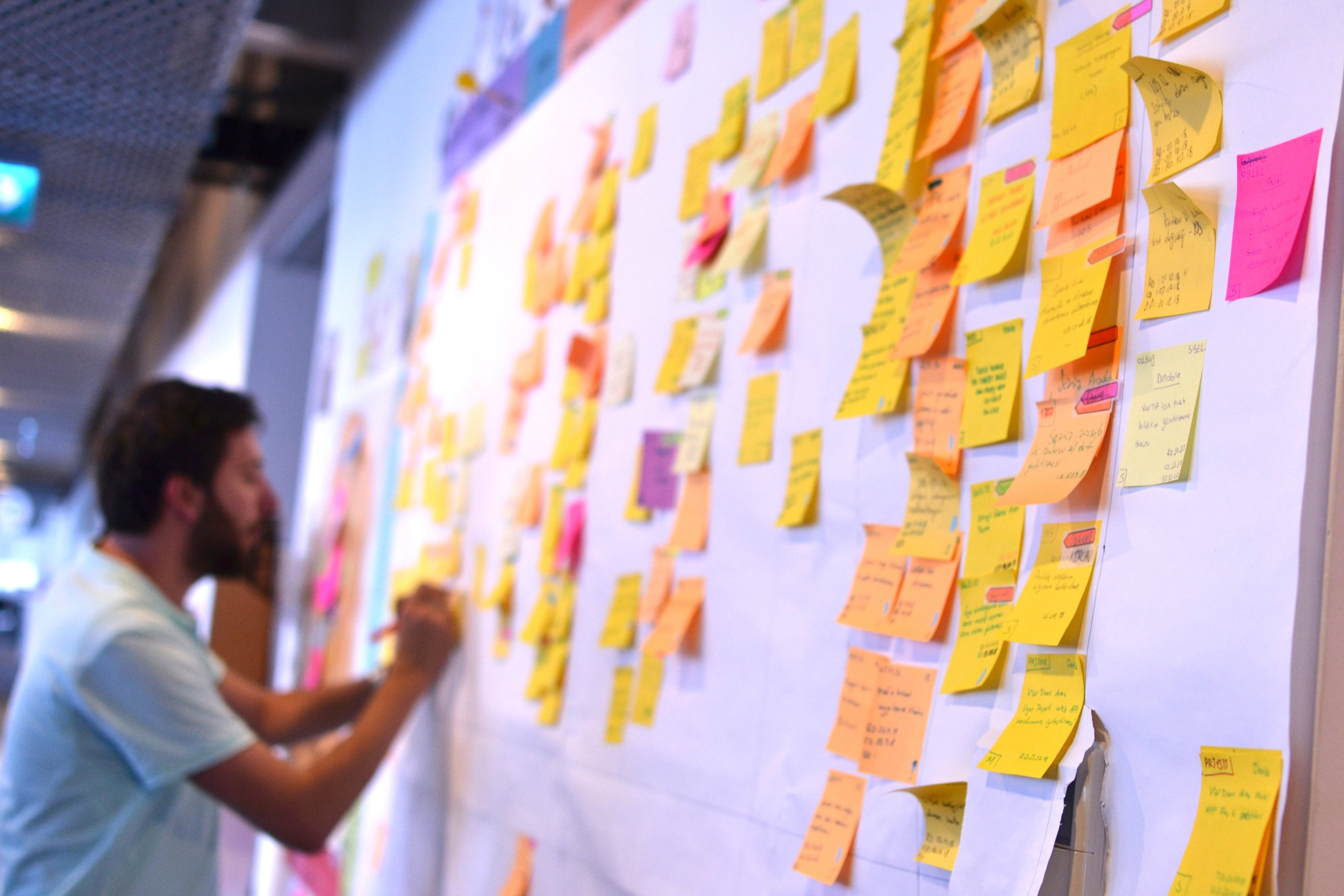
Affinity Map of current registration experience
Overwhelmed by information and processes
Confusion with iconography
Majority had trouble with readability
At this point I narrowed my goal to provide voter registration documents to bring to a polling place. California’s voter registration website formed the basis of my on-boarding registration flow as it has all the key questions applicable amongst the majority of states.
The data from both my local and online interviews lead to apps that were in direct competition. I found that language learning apps were key for accessible design and information distribution.
Participants unanimously stated the current registrar experience has:
Too much scrolling
Lack of readability & clarity of choice
Confusion on to what to do next
Feelings of stress
With the key questions used in the registrar process, I began to organize them in chronological order in tandem with CA’s official registrar document
Lo-Fi Prototype
Iteration
After creating the Lo-Fi prototype, I prepared an 8 question survey for participants to fill out before I began conducting a usability test. Without any prior guidance on how to use the app I felt I got enough feedback to use for the next stage of designs. From the user tests, I’ve boiled it down to the five most prevalent issues preventing flow completion:
Separate information to reduce mental load
The ability to move backward to correct any errors
Indication of choice to provide clarity
Filling out forms felt tedious and boring
Language preference to be more inclusive
Style Guide
Utilizing Apple’s Night Mode palette combined with accessibility guidelines the colors of all the assets tested very well especially those with light sensitivity. The dark tones highlight the Vivid greens that synonymously indicate progress and choice. Custom animations were used to gamify the process and give context to the information given. Background elements would still play a role in the storytelling of each key question of the registrar, but in a consistent desaturated blue as to not pull focus from the information above.
https://www.figma.com/proto/08SGJLnaUBfZwRi3kQQ6Es/RegiVote-HiFi-Prototype?node-id=44%3A503&scaling=scale-down&page-id=43%3A266&starting-point-node-id=44%3A503
HiFi Mobile Prototype: Click Here
https://www.figma.com/proto/08SGJLnaUBfZwRi3kQQ6Es/RegiVote-HiFi-Prototype?node-id=287%3A4988&scaling=scale-down&page-id=43%3A266&starting-point-node-id=287%3A4988&show-proto-sidebar=1
HiFi Desktop Prototype: Click Here

Reflections
The interviews I’ve conducted prior to any designs aided me in making crucial decisions early on in the process. Scoping down the app to have the proper documentation to bring to a polling place made the app accessible to any state in the U.S. and would not have been possible without the foresight from those participants. Spending the extra time in creating the animations specifically resulted in higher conversion rates as well as slightly faster Time on Task. I would like to add a scannable ID feature utilizing a phone’s camera, depending on the percentage of users that have a driver’s license.
Thank you and I hope to hear from you!


